Making KDE look a little more like Gnome
There is a dilemma with linux which I think is partially why it has never truly made it to the desktop. There are two major interfaces – KDE and Gnome. These two have been battling it out for as long as I can remember – some people prefer the ‘Gnome look’, others prefer KDE.
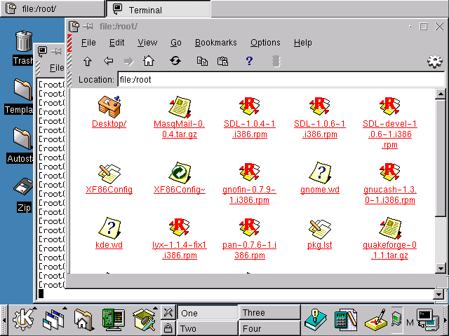
I’ll admit, I started out enjoying KDE as it had a more finished feel to it and nice icons (outlines were the theme at the time). Here’s KDE in the year 2000 (The lets-immitate-windows days).
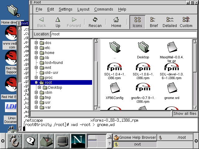
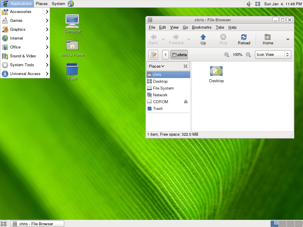
Gnome always felt a step behind. Here’s how Gnome looked. Notice the window borders are harsher, the ‘unfinished’ look to the icons, and unnecessary buttons behind the icons at the bottom.
Then things got different. OS X was coming out and had glossy buttons, and Windows was adding extreme colourful window borders everywhere. KDE didn’t know what to do so it copied both, while adding more options to customise how everything worked.
Gnome instead decided to clean up and get a more fuzzy basic look to it. This is when I switched to Gnome.
Gnome had the right amount of settings to change it to the windows start bar style, and had a warm fuzzy look to it that made you want to use it. This to me is the golden age of Gnome.
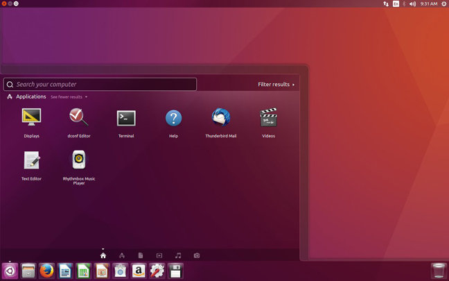
Then everyone became fascinated with the OS X Dock, Tablets were the future, Ubuntu grew to the top of the Linux ladder overtaking Fedora, and ‘flat’ design happened. So now we have huge fragmentation and 4 interface players. KDE decided to do a complete rewrite called Plasma, and added every option possible. Here’s what it looks like now:
Gnome decided to go to a mix of OS X and Tablet, removing many settings, giving a really nice warm and fuzzy clean appearance at the extreme expense of usability.
Ubuntu came along and introduced ‘Unity’, which has the Gnome ‘feel’ and is admittedly slightly more usable than Gnome – but not much better – and the theme just doesn’t look clean after a while.
Edit: They have apparently added the ability to move the dock to the bottom of the screen so this should make it MUCH better – hopefully they can eventually change it back to a proper taskbar looking arrangement. To do this, install dconf-editor and navigate to com > canonical > unity > launcher > launcher-position.
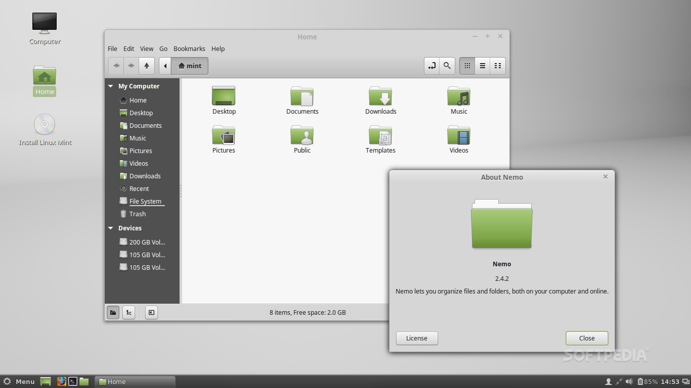
Then there’s Linux Mint with Cinnamon. This has the old Gnome / Windows taskbar style which is extremely useable – however it’s almost exclusively on Linux Mint (which is Ubuntu based anyway so all good), and has a horrible grey theme.
So at the moment – until Cinnamon gets a new theme and becomes one of the big players, I feel the best option is to use KDE but give it a Gnome ‘feel’. This can be achieved by changing the font to Cantarell:
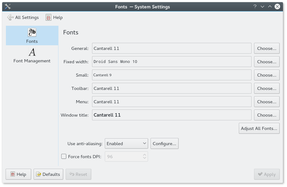
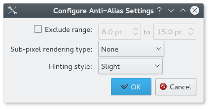
Changing the font smoothing to make it a little friendlier:
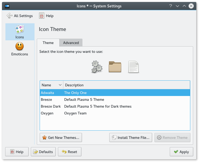
Changing the icon theme to Adwaita:
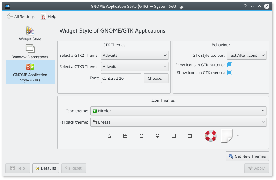
Fixing up the GTK Icon themes:
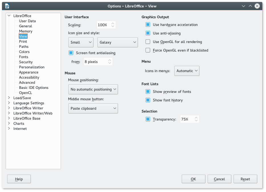
And adjusting openoffice’s icon settings:
This gives KDE a more friendly feel. It’s like Gnome and KDE had a baby. Hopefully we can get away from this overly simplified tablet theme and make something more like where we were before Tablets and Docks but still useable, like Windows 10 has.